Sara Hillman, Aishwaryaa Kannan, and Tim Tizon
***
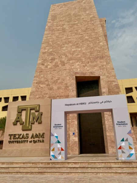
Figure 1: Transitional “Hayakom at HBKU” sign marking HBKU’s presence in the TAMUQ building (picture taken by authors)
Walking into the Texas A&M University at Qatar (TAMUQ) building today feels different from just a year ago. As part of an ongoing project, several students and I (Sara) have been documenting the visual and linguistic changes taking place across the TAMUQ building in Education City, Qatar. The university’s traditional greeting Howdy, its maroon banners, and the familiar Aggie insignia (the shared nickname and identity of Texas A&M students and alumni) are still visible, yet they are beginning to lose their dominance. In their place, visitors are now welcomed by new blue-and-white signs displaying a translingual message: “Hayakom at HBKU.” The Gulf Arabic word hayakom, meaning “welcome,” has become increasingly prominent on posters, banners, and orientation booths. Although much of this signage is not yet permanently installed, the shift is already evident.
This evolving dynamic from Howdy to Hayakom reflects more than just a sudden change in branding. It marks a shift in Qatar’s higher education landscape, as the U.S. branch campus TAMUQ, part of Qatar Foundation (QF) and located in Education City, prepares to close in 2028 while its fellow QF institution, the homegrown Hamad Bin Khalifa University (HBKU), gradually assumes its facilities and students. The closure decision followed a surprise February 2024 vote by the Board of Regents of Texas A&M University’s main campus in College Station, Texas, which cited regional instability and a renewed focus on its U.S. mission. Soon after that announcement, the three of us began photographing every Texas A&M emblem, sign, and display in the building, creating a record to track the changes over time and to preserve a piece of the campus’s history. Over the past year, we have watched the visual culture of the space shift in real time. Through signage, slogans, and colors, the linguistic landscape of the building and the identities it projects tell a story of institutional transformation, cultural localization, and shifting ideologies of belonging.
The educationscape as a site of change
Scholars of linguistic landscapes often remind us that signs do more than convey information; they materialize power, ideology, identity, and values in public space (Ahmad, 2022; Hillman & Ahmad, 2024). The same can be said for educationscapes, where universities use visuals, language, and architecture to communicate identities, values and affiliations (Krompák et al., 2022).
Figure 2: Howdy signage inside the TAMUQ building representing Aggie identity and transnational continuity (picture taken by authors)
At TAMUQ, Howdy has reigned supreme for more than twenty years. As the official greeting of Texas A&M, faculty, staff, and students at the main campus use it to welcome one another and to greet campus visitors as a sign of Aggie hospitality. On the Doha campus, Howdy appears in signage, emails, and posters for Student Affairs events such as “Howdy Week.” Its cheerful informality reinforced continuity between College Station and its branch campus thousands of miles away.
Now, however, Howdy coexists with Hayakom. HBKU has introduced its own greeting, one that foregrounds the local linguistic and cultural context. HBKU Student Affairs has also begun cultivating its own traditions: “Hayakom Tuesday,” echoing TAMUQ’s “Howdy Week,” and “Blue Thursday,” where students are encouraged to “wear blue, show blue, scream blue!”—a parallel to TAMUQ’s maroon-and-white Spirit Thursdays where Aggies are encouraged to “embrace the maroon and white.”
This bilingual, bicultural overlap reflects the liminal moment both institutions currently inhabit. TAMUQ has not yet closed, and many of its students and faculty still identify strongly with Aggie traditions. At the same time, HBKU is asserting itself through new rituals, slogans, and events.
From maroon to blue: Rebranding space and identity
Alongside slogans, colors play an equally prominent role in communicating institutional belonging. TAMUQ’s maroon and white palette linked it visually to its U.S. home campus, reinforcing transnational identity and Aggie pride. Walking through the corridors meant walking through a transplanted Texas brandscape, complete with photos of College Station landmarks.
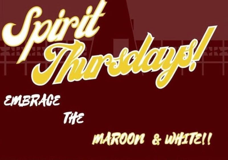
Figures 3a and 3b: HBKU “Blue Thursday” and TAMUQ “Spirit Thursday” posters on Instagram (screenshots taken by authors)

Today, that palette is fading. Blue and white, the colors of HBKU, now dominate new signage, orientation banners, and student activities. Cushions in the front entrance lobby now feature HBKU’s blue and white geometric logo, and the hallways are lined with images of the Minaretein building (meaning two minarets), HBKU’s signature architectural complex that includes both a mosque and academic colleges, replacing many of the Texas-centric visuals that once dominated the space.
The color shift is more than aesthetic. It signals a deliberate rebranding that seeks to reshape not only institutional identity but also the sense of belonging for students, faculty, and visitors.
Signs of state and leadership
The changes are also visible in the presence of Qatar’s leadership. At the building’s entrance, portraits of the Emir, Sheikh Tamim bin Hamad Al Thani, and his father, Sheikh Hamad bin Khalifa Al Thani, now hang prominently. Such state imagery was absent during the TAMUQ era, when visual emphasis rested on Aggie traditions and the global prestige of Texas A&M. Their presence today highlights HBKU’s identity as QF’s homegrown university and its role in advancing national priorities. The walls themselves remind visitors that HBKU is a Qatari institution, rooted in the state’s vision for education and innovation.
Bilingualism and the Arabic language protection law
Another notable change is that TAMUQ operated under a cross-border partnership agreement with QF and was not required to maintain bilingual signage. As a result, its displays were often inconsistent, with some appearing only in English and others in both English and Arabic. However, HBKU complies more with Qatar’s 2019 Arabic Language Protection Law (Law No. 7 of 2019 on the Protection of the Arabic Language). This law requires Arabic to be the primary language on all public signage.
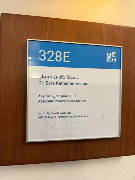
In practice, this means HBKU’s official signage is almost always bilingual, with Arabic typically placed above or beside the English text. This layout gives prominence to Arabic while reflecting HBKU’s use of English as its official medium of instruction and as a shared language among its diverse student body
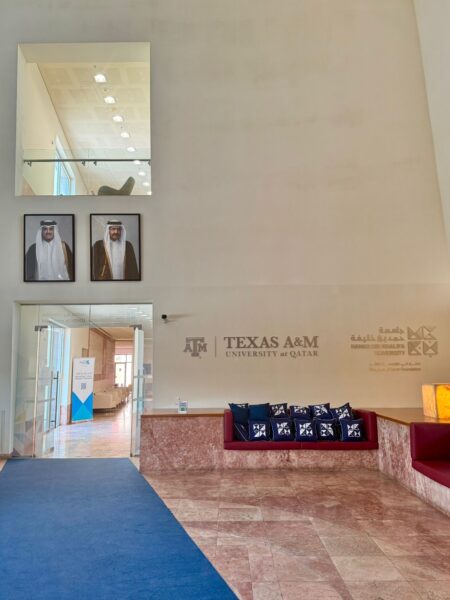
Figure 4: Portraits of Qatar’s leadership, including the Emir Sheikh Tamim bin Hamad Al Thani (left) and the Father Emir Sheikh Hamad bin Khalifa Al Thani (right), now displayed at the building’s entrance (picture taken by authors)
The difference is visible, for example, in faculty office nameplates. At TAMUQ, they appeared only in English, whereas at HBKU they are consistently bilingual, with Arabic displayed first. This small but significant shift reflects how language policy is made material in the everyday visual culture of the university.
Belonging and identity in flux
What does it mean for students, faculty, and staff to inhabit this shifting educationscape? This is a question we are currently exploring in our ongoing research about the transition from TAMUQ to HBKU. For Aggies, watching maroon and Howdy fade from view may bring a sense of sadness, as if traditions and ties to the wider Aggie network are slowly being eroded. For new students entering through HBKU, however, Hayakom and the visible presence of Qatari leadership may foster a sense of national belonging and legitimacy that TAMUQ, as a foreign branch campus, could perhaps not fully provide.
The transition also brings into focus broader debates about language, identity, and higher education in Qatar. For years, international branch campuses have stood as symbols of global mobility and English-medium internationalization. HBKU, by contrast, is an explicitly Qatari project, though still English-medium. Its bilingual signage acknowledges the centrality of Arabic in public life while retaining English as the dominant academic language. In this sense, the visual and linguistic rebranding of the building does more than mark institutional change; it materializes Qatar’s ongoing negotiation between global aspiration and national affirmation.
From global brand to national–international project
The TAMUQ-to-HBKU shift can be read as part of a wider trend. Around the world, branch campuses have been praised for providing global exposure but also critiqued for being costly, unsustainable, or disconnected from local needs (Bollag, 2024; Kim, 2025). By 2028, TAMUQ will join the growing list of international branch campuses that have either closed or been absorbed into national institutions. Yet this trajectory is not universal. In the Gulf and parts of Asia, other branch campuses continue to expand, supported by government funding and demand for global higher education pathways.
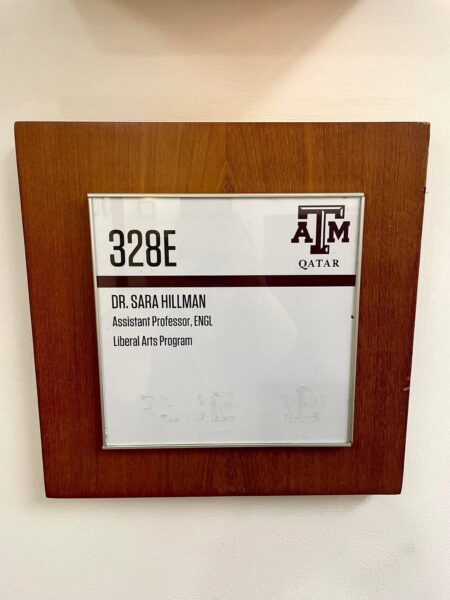
Figures 5a and 5b: TAMUQ English-only office nameplate and HBKU bilingual Arabic–English office nameplate (photos taken by authors)
In this case, the closure decision was not driven by Qatar’s plans but rather by political currents in the United States, where heightened scrutiny of foreign funding and a turn toward isolationism have reshaped attitudes toward international partnerships. Although HBKU is QF’s homegrown university, it was intentionally designed to be both nationally grounded and internationally oriented—an English-medium institution that continues to attract global faculty and students while advancing Qatar’s local educational priorities. The move from Howdy to Hayakom thus signals more than a greeting. It marks a broader shift from borrowed traditions to localized yet globally connected narratives of identity and belonging.
Reading the signs
As universities, like cities, are built through language and signs, paying attention to the educationscape reveals the symbolic and material contours of change. At TAMUQ/HBKU, the coexistence of Howdy and Hayakom, maroon and blue, photos of Aggie landmarks and Minaretein, encapsulates a moment of transition.
These signs remind us that institutional change is not only about policy or governance. It is lived and seen in everyday spaces: on banners, cushions, doorways, and Instagram posts. They invite us to consider how language, color, and imagery make and remake belonging in higher education. For now, both greetings echo in the same hallways. Yet with each new sign and slogan, the balance tilts, signaling which voice will carry forward for now.
References
Ahmad, R. (2022, October 11). Mal Lawwal: Linguistic landscapes of Qatar [Blog post]. Language on the Move. Mal Lawwal: Linguistic landscapes of Qatar – Language on the Move
Bollag, B. (2024, December 31). International branch campuses spread in Mideast amid concerns about costs, impact. Al-Fanar Media. https://www.al-fanarmedia.org/2024/12/international-branch-campuses-spread-in-mideast-amid-concerns-about-costs-impact/
Hillman, S., & Ahmad, R. (2025). Combatting Islamophobia: English in the linguistic landscape of FIFA World Cup 2022. In K. Gallagher (Ed.), World Englishes in the Arab Gulf States. Routledge.
Kim, K. (2025, July 4). Branch campuses and the mirage of demand. SRHE Blog. https://srheblog.com/2025/07/04/branch-campuses-and-the-mirage-of-demand/
Krompák, E., Fernández-Mallat, V., & Meyer, S. (2022). The symbolic value of educationscapes—Expanding the intersection between linguistic landscape and education. In E. Krompák, V. Fernández-Mallat, & S. Meyer (Eds.), Linguistic Landscapes and Educational Spaces (pp. 1–27). Multilingual Matters.
Law No. (7) of 2019 on the Protection of the Arabic Language. (2019). Al Meezan, Qatar Legal Portal. https://www.almeezan.qa/EnglishLaws/Law%20No.%20(7)%20of%202019%20on%20Protection%20of%20the%20Arabic%20Language.pdf
Author bios
Dr. Sara Hillman is an Associate Professor of Applied Linguistics and English at Hamad Bin Khalifa University (HBKU). Prior to joining HBKU, she spent nearly a decade at Texas A&M University at Qatar. Her research spans emotions, identity, and (un)belonging in English-medium instruction (EMI) and transnational higher education, World Englishes and sociolinguistics, linguistically and culturally responsive teaching and learning, and language and intercultural communication. Her current research explores the visual signage and symbols of Qatar Foundation’s international branch campuses and the homegrown Hamad Bin Khalifa University and how they project identity, values, and belonging.
Aishwaryaa Kannan is a third-year Electrical and Computer Engineering student at Texas A&M University at Qatar (TAMUQ). Alongside her studies, she has been deeply engaged in student leadership and research, serving as the Founding President of the Management & Marketing Association and as a student research partner on the campus closure study led by Dr. Sara Hillman. Having experienced the TAMUQ-to-HBKU transition firsthand, she connects personally with the paper’s themes of identity and belonging. Her interests span technology, education, and human connection, and she is passionate about how innovation and culture shape everyday experiences on campus.
Tim Billy Tizon is a third year Electrical and Computer Engineering undergraduate student at Texas A&M University at Qatar (TAMUQ). In addition to his studies, he has been actively involved in campus life through student leadership and research. He served as Secretary of the Leadership Experience Club for two years and is currently a member of the Management and Marketing Association. He has also participated in research across several disciplines, including communications and machine learning.